Lalatte: Crafting Digital Experiences for Coffee Culture
Visual Identity and User Experience
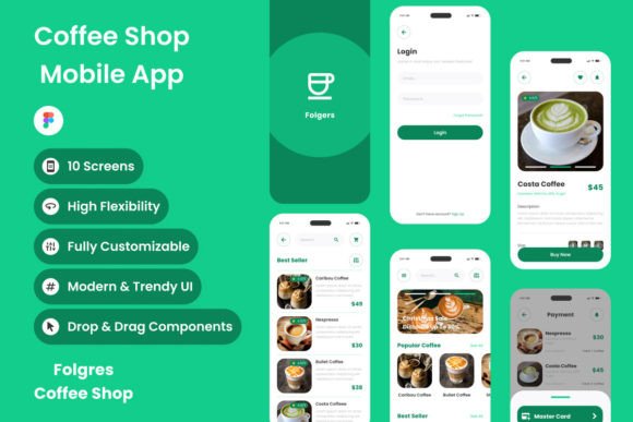
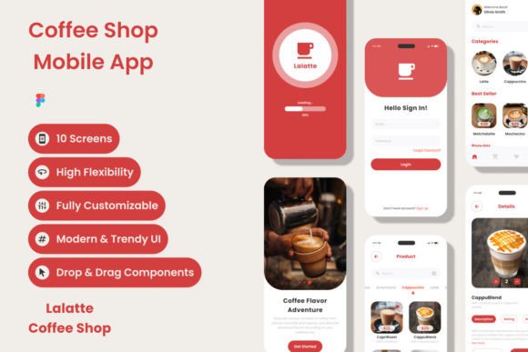
The Lalatte - Coffee Shop Mobile App design kit is built on the philosophy of premium interaction. It captures the "epitome of coffee culture" by focusing on the sensory details that matter: the rich browns of a fresh roast, the creamy textures of milk, and the warm, inviting atmosphere of a brick-and-mortar shop, all translated into a digital interface. The visual personality of this UI kit is sophisticated yet approachable. It avoids the cold, sterile look of generic utility apps in favor of a design that feels tactile and organic.
From a layout perspective, the screen design is high-quality, utilizing a grid system that balances whitespace with content density. This is crucial for mobile design where screen real estate is limited. The typography choices within the mockups lean toward modern typography, pairing clean sans-serif fonts for readability with elegant display fonts for headings. This creates a clear visual hierarchy, ensuring that users can navigate menus, place orders, and explore loyalty rewards without friction. The color palette is carefully curated to evoke warmth, using deep espressos contrasted with soft creams and muted earth tones. This isn't just a collection of buttons; it is a comprehensive brand identity starter kit.
Adaptability for Designers and Entrepreneurs
One of the most significant pain points in UI design is the rigidity of assets. The Lalatte kit addresses this by offering a design that is easy to adjust. For the freelance designer or the small business owner trying to mock up their own app, the organized layers and global text styles are a lifesaver. Instead of manually updating the font size on fifty different screens, a change to the global style propagates instantly. This consistency ensures that whether a user is on the "Order" screen or the "Profile" page, the experience feels unified.
The file includes a .fig format, making it fully compatible with Figma, the industry standard for collaborative design. This allows teams to work in real-time, a necessity for entrepreneurs working with remote designers. The inclusion of open-source fonts also removes the barrier of expensive licensing fees for the typography used in the mockups, allowing startups to allocate their budget elsewhere. Furthermore, the neat organization of layers makes it a fantastic educational tool. Hobbyists and design students can deconstruct the files to understand how professional web design and mobile interfaces are structured, learning about component-based design and atomic design principles through practical application.
Strategic Applications and Brand Consistency
While the primary application is a mobile app, the principles and assets within Lalatte extend far beyond the phone screen. The visual language established here is perfect for packaging design. A coffee brand can take the color styles and typography from the app to design coffee bags, cups, and loyalty cards, ensuring that the digital experience matches the physical product. This omnichannel consistency builds trust with customers.
For social media graphics, the high-quality layout serves as a template for Instagram stories and feed posts. The aesthetic is inherently "Instagrammable," designed to highlight the artisanal nature of the product. Marketers can use the visual style to create cohesive campaigns that drive app downloads. Additionally, the design principles apply to editorial design for blogs or digital magazines focused on food and lifestyle. The way the app handles imagery and text can inform how a publisher lays out a feature article on the "artistry of coffee crafting."
Technical Considerations and Workflow Integration
When integrating the Lalatte assets into a workflow, it is important to treat them as a foundation rather than a final product. The compatibility with global styles means you should define your client's specific brand colors and typefaces early on. If you are using this for a logo design project, ensure the logomark scales well within the app's header components.
For developers and technical designers, the organized file structure reduces the time spent hunting for assets. However, remember that the images included are for preview purposes only. A practical recommendation for users is to replace these placeholder images with professional photography of actual products as soon as possible. Stock photos can make a design look generic; high-quality, authentic photography will elevate the "Lalatte" aesthetic from a template to a bespoke brand identity. By leveraging the clean structure and modern typography